How Do I Make My Contractor Website Mobile-Friendly?
Make your contractor website mobile-friendly with a real-phone test for navigation, forms, click-to-call buttons, larger text, third-party tools, and receipt.
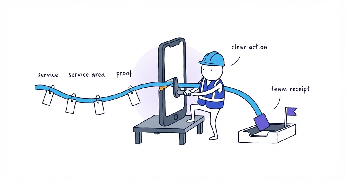
A contractor website is mobile-friendly when a customer can use it on a real phone to:
- identify the service and service area;
- read the proof needed to make a decision;
- choose the right call, request, or booking path;
- complete that action without zooming, horizontal scrolling, mis-tapping, or losing entered information.
Test these four parts of the site first:
- the homepage;
- the highest-priority service page;
- the contact or service-request path;
- every active booking, chat, text, financing, payment, map, or upload flow.
A desktop preview cannot reproduce a phone’s keyboard, calling, accessibility settings, or every widget.
Create a Contractor Website Mobile Test Record
Create one record for each page or flow before testing. This format also fits on a phone:
Page or flow:
Phone and browser:
Customer task:
Expected customer result:
Expected team result:
Actual result:
Severity: Blocker / Major / Minor / Pass
Repair owner:
Retest date and result:
This keeps the review on blocked tasks, not design preferences.
Here is a completed hypothetical record. It demonstrates the method; it is not a real Northside result:
Page or flow: Service-request form
Phone and browser: Small-screen Android phone, Chrome
Customer task: Repair one email error and submit a drain-clearing request
Expected customer result: Clear confirmation
Expected team result: New request appears in the intake system
Actual result: Confirmation appeared, but no request reached the intake system
Severity: Blocker
Repair owner: Website administrator
Retest date and result: August 15 — Pass; confirmation appeared and test lead reached the intake system
Prepare a Real-Phone Website Test
Gather different phones where practical; customer browsers; public URLs; verified business information; a labeled test lead; access to the receiving system; and each website tool’s owner. Start with two different phones, then add devices based on traffic and risk.
Step 1. Write One Customer Task for Each Page
Use this sentence:
On [page], a [customer] must be able to [complete one task] and receive [observable result].Northside Plumbing is a fictional business serving homeowners in Dallas and Irving:
- Homepage: A Dallas or Irving homeowner must identify the relevant service and reach the request or call path.
- Drain-clearing page: A homeowner must understand whether the service fits and submit a service request.
- Request page: A homeowner must repair an error, submit details, and see what happens next.
- Booking flow: An eligible customer must reserve capacity and receive confirmation.
Write the customer’s result, not the page’s appearance. “Submit a drain-clearing request that reaches [system]” is
testable; “review the mobile design” is not.
Step 2. Start Signed Out on a Real Phone
Open the public URL signed out in a private window. Avoid administrator sessions, saved values, cached permissions, and internal preview links.
Record:
Phone model and operating system:
Browser and version:
Mobile data or Wi-Fi:
Public URL:
Test date:
Text-size or accessibility setting:
Use responsive browser tools later to reproduce failures across widths. The real phone remains the acceptance test.
Step 3. Identify the Business, Service, Area, Proof, and Action
Give the phone to someone who did not write the page. Without explaining Northside first, ask the tester:
- Which business is this?
- What service or customer problem is this page about?
- Does the business serve the relevant location?
- What evidence supports the page’s claims?
- What would you do next?
Google recommends responsive design with equivalent primary mobile and desktop content. Layout may differ, but
Northside’s mobile drain-clearing page must retain the service, Dallas and Irving coverage,
[verified service-specific proof], and Request service action.
If a tester cannot identify the service, area, proof, or action despite a working layout, the contractor service-page guide helps rebuild that decision path before retesting.
Step 4. Tap the Navigation and Every Primary Action
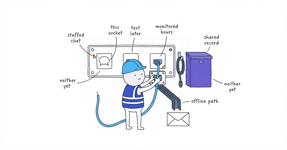
Open and close the mobile menu. Follow the primary action from the top and later decision points on the page. Test the phone link, form link, booking link, and any customer-facing fallback that applies.
Watch for:
- the wrong control activating;
- chat, cookie, header, or bottom controls covering an action;
- a menu that cannot close or return focus sensibly;
- the back action losing necessary context;
- an unexplained desktop-only destination;
- unreachable controls or invisible keyboard focus.
The WCAG 2.2 Target Size (Minimum) criterion uses a target of at least 24 by 24 CSS pixels or sufficient spacing, with documented exceptions. Use that standard to flag controls that are difficult to activate. It does not mean every button must be exactly 24 by 24 pixels.
Step 5. Read the Page Normally, Then Increase Text Size
Scroll top to bottom in portrait without zooming. Increase the phone’s text size or browser zoom, then repeat the important section.
Check for:
- horizontal scrolling or clipped text;
- phone numbers, headings, or buttons that do not wrap;
- important image content cropped out;
- unusable tables or hover-only information;
- floating controls covering content;
- late movement of a control the customer is about to tap.
Rotate fixed-format components such as calendars and upload controls once to expose hard-coded widths.
Step 6. Complete the Form With the Phone Keyboard
Tap every field and check whether the phone provides the right input:
- a suitable phone or email keyboard;
- accurate address help with manual entry;
- usable date, time, and photo controls;
- labels that remain visible after typing;
- no formatting that corrupts an email or code.
Create at least one error. For example, omit a required field or enter an invalid email. Submit and verify that the form:
- explains and moves attention to the problem;
- keeps the other completed fields;
- leaves the error visible above the keyboard or sticky controls;
- accepts the corrected request.
After the website shows success, check [system]. A success message without team receipt is a failed test.
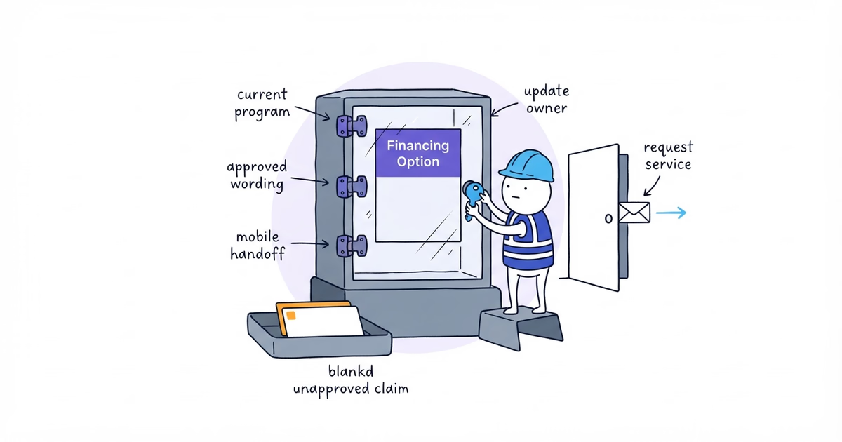
Step 7. Complete Every Third-Party Flow
Test every booking, chat, financing, map, review, payment, or upload widget as part of the customer experience.
Test whether:
- it fits and its keyboard, focus, close, and back controls work;
- entries survive an authorized redirect and return;
- branding, terms, and consent text remain visible;
- completion reaches the expected team system;
- it conflicts with another floating tool or causes a serious delay.
If the flow fails, change its configuration, placement, load behavior, or channel. Vendor ownership does not change the result.
Step 8. Rank, Assign, and Retest Every Failure
Use three severities:
| Severity | Definition | Example |
|---|---|---|
| Blocker | The customer cannot complete the main task or receives a false result | Submit does nothing; wrong number; booking is not recorded |
| Major | The task takes confusion, workarounds, or repeated attempts | Keyboard hides error; chat covers CTA; terms cannot be read |
| Minor | The task succeeds but a non-critical visual or convenience issue remains | Inconsistent spacing after a supporting image |
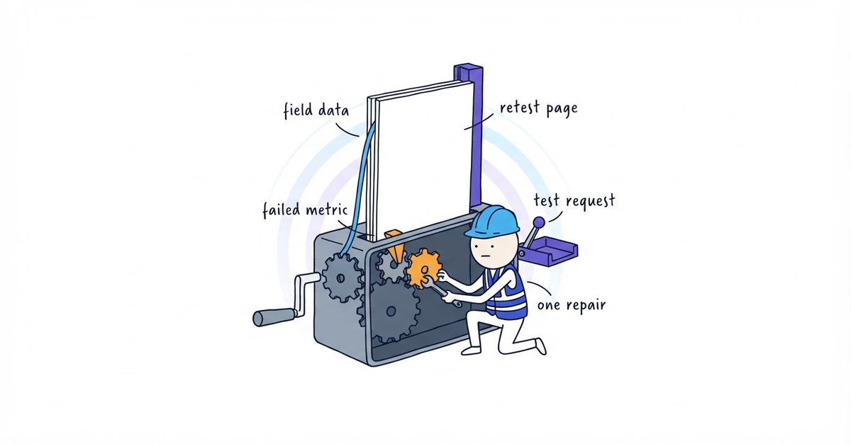
Fix blockers first, then major failures. Give every issue an owner and retest date. “Deployed” is not a passing result; repeat the original task on the recorded phone.
If the current site still cannot keep its main customer paths usable after the available layout and widget settings are corrected, our free website setup can rebuild a simpler mobile path that customers can complete.
Run a Complete Contractor Website Mobile Test
Use this final sequence:
1. Open the homepage signed out on [phone and browser].
2. State the service, Dallas/Irving coverage, proof, and primary action.
3. Open and close the mobile navigation.
4. Tap Request service.
5. Complete the form, including one validation error and optional photo.
6. Confirm the success message and verify the request in [system].
7. Place an agreed test call from the drain-clearing page.
8. Complete each third-party flow, then repeat the critical action with larger text.
9. Record failures, assign owners, repair, and retest.
Northside should create separate records for the homepage, drain-clearing page, request form, and every active third-party flow. Each failure needs its own owner and retest.
Mobile-Friendly Website Checklist
The first mobile QA pass is complete when:
- the homepage, priority service page, request path, and active embeds were tested on real phones;
- service, area, proof, and next action remain available;
- navigation and controls work without overlap;
- text, images, and larger type fit without horizontal scrolling;
- the form has suitable inputs and repairable errors;
- a test call, request, or confirmed booking reaches the intended team system;
- all blockers and major failures were repaired and retested;
- each remaining minor issue has an owner or an explicit backlog decision.
Stop the release-blocking pass when the core customer tasks pass. Record small visual differences for maintenance; do not keep the main path offline for a harmless spacing issue.
Frequently Asked Questions About Mobile-Friendly Contractor Websites
Do I need a separate mobile website for my contractor business?
Usually not. A responsive website can serve the same primary service, area, proof, and contact content in layouts that adapt to different screens. The acceptance test is whether those customer tasks work on real phones, not whether the business maintains a separate mobile URL.
When should I repeat a contractor website mobile test?
Repeat the affected customer path after changing navigation, forms, phone links, page templates, or third-party widgets. Also retest when a customer reports a failure, a browser or tool changes materially, or the team sees an unexplained drop in mobile inquiries.
Sources
- contractor-website
- mobile-friendly-website
- responsive-website
- mobile-contact-form
- contractor